Phillips 66 Annual Report
As one of the largest energy companies in the world, Phillips 66 has a lot to showcase in its annual report. Well-designed and visually appealing information is essential to convey the company's message and financial performance to its stakeholders. That's where graphic designing comes into play.
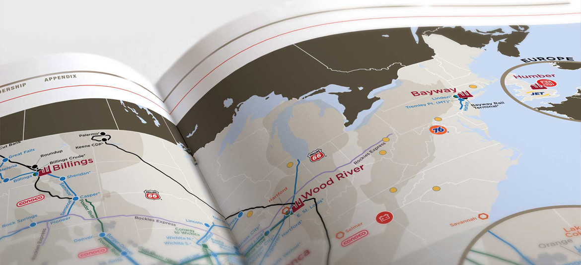
The Phillips 66 annual report is an excellent example of effective graphic design in financial reporting. The piece features a clean, modern layout reflecting the company's brand image. A consistent color palette, typography, and imagery create a cohesive look and feel throughout the report.
The cover page sets the tone for the report with a striking image representing the company's commitment to innovation. Using bold typography and a simple layout makes the cover page stand out and grabs the reader's attention.
The use of infographics and data visualization is another highlight of the report. The designers have presented complex financial data in easy-to-understand charts and graphs. Using color coding and icons helps the reader quickly identify key trends and insights.
The report also includes high-quality images of the company's operations and employees, which adds a personal touch and helps the reader connect with the brand. The photographs are carefully selected and edited to maintain a consistent visual style throughout the report.
Overall, the Phillips 66 annual report is an excellent example of how graphic design can enhance the impact of financial reporting. The designers have used a combination of typography, color, imagery, and data visualization to create a visually compelling report that effectively communicates the company's message to its stakeholders.